The Art of Framing: Colour Ideas for Picture Frames
by Grace Evans January 15, 2024 · Home / House & Garden
Art is one of the best ways to elevate the aesthetics of your living space. Whether it’s photos, prints or paintings, art has the power to give any interior some vibrancy.
Choosing the art you love is only one step. The framing also plays an important role in how we perceive the image, emphasising the beauty of the art and how it compliments the overall home decor. When it comes to framing, here are some ideas to help you choose.
Black Picture Frames for a Timeless Art Display
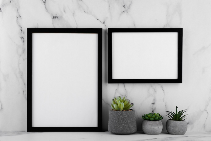
Black has a classic and timeless elegance. It remains one of the most popular frame colours for capturing the true essence of art and photos. One of the reasons why black picture frames are highly favoured is their versatility. They can complement a wide range of art and photo styles and work well with nearly any home decor.
Their versatility makes them a popular choice amongst artists, photographers or anyone who wants to create a seamless integration of the frame with the art and the overall home style. The sleek elegance of black frames enhances the visual impact of the photo or painting without overshadowing the art itself.
This type of framing can match both traditional and modern styles and is highly popular when it comes to creating wall galleries. Furthermore, it can successfully elevate the overall aesthetic of the room without taking away from the beauty of the art.
Use black framing if you want to create a bold look that matches the darker aspects of the art. What’s more, it not only provides an elegant and formal look but also adds depth and drama to your walls.
Black manages to draw attention to the displayed photo or painting by creating contrast against the artwork, which helps to emphasise the details and the colours of the image. It creates a visual focal point and enhances the overall visual experience. If you want to ensure your wall art has an enduring appeal, the timeless elegance of black frames never goes out of style.
Get Inspired By the Art Itself
Besides opting for the versatile picture frames, you also have the option to choose a more unusual colour. However, the trick here is to pick a colour that will complement the art in a beautiful way.
One way to do so is to identify a common colour that shines through the different artworks in your interior and choose a matching frame to create a harmonious look. But if you want to make the artwork pop, you can choose a colour that contrasts with the dominant hue.
An additional step to help you determine the right frame colour is to analyse the overall mood and tone of the artwork itself. Consider whether it’s an expressive artwork with lots of intricate details, if it’s abstract art, a realistic painting or if you simply want to display family and personal photos.
Match It with Your Interior’s Colour Palette
Coordinating the colour of the frames with the overall colour scheme in the living space makes a lot of sense for creating a harmonious look. For instance, if most of your furniture comes in a timber finish or is crafted from natural wood, choosing wooden frames is a good example of harmonising the colours in the room.
If your room or home style has a modern and elegant appearance, choosing metal frames in silver, gold or black adds a touch of sophisticated look and elegance. However, if your space has a minimalist style and has only monochrome colours, you might want to break down the monotone look by incorporating colourful frames.
On the other hand, if the room is a mash of different colours, you can try to tone down the colorfulness by selecting frames in black and white or wood colour.
When in Doubt, Go Neutral
Neutral colours are a go-to choice for many homeowners and photographers when it comes to framing because of their timeless and sophisticated aesthetics. Although you might think there is not a lot of choice when it comes to neutral colours, you’d be surprised by the sheer availability of different shades and tones of neutrals. Starting from varying shades of white, and grey, to black, beige and natural wood, the palette of colours is pretty impressive.
Frames in neutral colours can complement nearly every home style and seamlessly incorporate a touch of sophistication into the living space, without disrupting the beauty of the artwork. What’s more, the neutral colours allow the artwork to take center stage and still be able to provide a harmonious and calming effect. Additionally, neutral colours remain a timeless choice that works well with different home decor.
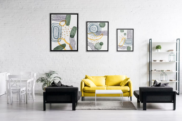
Make a Statement With Bold Colours
Don’t be afraid to go bold with strong and expressive colours to create lively and playful energy around your home. Displaying your art in vibrant frame colours is an effective way to draw attention, making it a focal point of the area. Bold colours can elevate your home style and aesthetics and infuse a flair of individuality.
You can opt for frames in hues from the same colour palette in the art or play with frames in different colours that will complement each other. It creates an expressive visual journey and gives a certain dynamic to the space.
As you can see, the choices of playing with different framings are endless. There are many variations for a successful display of your art and photos, you just need to dig deeper into the art of framing and find your preferred style. At the end of the day, it all comes down to a personal preference.